7 Irresistible Font Trends 2026 That Will Make Your Brand Look Unforgettable
Fonts are not just sitting pretty on the page anymore.
In 2026, typography is becoming more flexible, more expressive, and much more involved in the way a brand feels. A typeface can make a business look elegant, playful, rebellious, trustworthy, nostalgic, or deliciously mysterious before anyone reads the full message.
That is why the font trends 2026 conversation matters. The right font does not simply decorate a design. It gives the design a voice. Strong web typography also helps that voice stay clear, attractive, and easy to read across different screens.
For Casloop Studio, this is where creativity gets fun. And for designers looking for that perfect type crush, Flirtype is the place to explore free fonts, test new styles, and find the letters that make a project feel instantly more alive.
Ready to meet the seven font trends that are stealing attention in 2026? Let’s flirt with typography.
1. Variable Fonts Are the Smart New Essential
Variable fonts are one of the most practical developments shaping the font trends 2026 landscape.
A variable font can contain a range of styles inside one font family. Depending on the typeface, designers may be able to adjust weight, width, slant, or other design axes without loading a completely separate file for every variation.
That flexibility is especially useful for websites and digital products. A heading can feel bold and dramatic on desktop, then become more compact on mobile. A brand can keep one recognizable type family while still creating several moods.
Variable fonts are perfect for designers who want consistency without boredom. You get one visual voice with plenty of room to move.
How to use variable fonts
Start with one axis, such as weight or width. Test the font in real headlines, buttons, product names, and paragraphs. If the type still feels clear at different screen sizes, you may have found a seriously charming design partner.
Browse free font collections on Flirtype to discover type families that could work beautifully in flexible digital layouts.
2. Expressive Display Fonts Are Stealing the Spotlight
Neutral fonts will always have a place, but designers are asking for more personality in 2026.
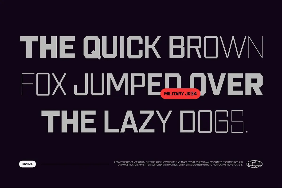
Expressive display fonts are bold, stylish, unusual, and sometimes wonderfully dramatic. They may feature oversized proportions, playful curves, unexpected details, chunky forms, or elegant contrast.
This is one of the most exciting typography trends 2026 because it gives brands an instant visual signature. A strong display font can make a short headline feel like a campaign. It can turn a product name into a memorable moment.
Use expressive fonts for:
- website hero sections
- campaign headlines
- posters and event graphics
- social media artwork
- packaging concepts
- fashion and beauty branding
- creative portfolios
Keep the body copy calmer. Let the headline flirt with attention while a readable supporting font keeps the conversation easy.
3. Modern Serif Fonts Are Having a Beautiful Comeback
Serif fonts are back, but they are not wearing their grandmother’s dress.
Modern serif fonts are becoming softer, cleaner, and more adaptable for digital design. They can feel editorial, premium, artistic, romantic, or quietly confident.
This makes them a lovely choice for brands that want to appear thoughtful and distinctive without looking too formal. Modern serif fonts work especially well for:
- fashion labels
- editorial websites
- lifestyle brands
- beauty and wellness businesses
- personal portfolios
- book and publishing projects
- elegant landing pages
Try pairing a beautiful serif headline with a simple sans-serif body font. The serif brings the emotion. The sans-serif keeps everything readable and balanced.
If you want to explore this mood without spending hours searching, browse serif collections and free fonts on Flirtype. Your next elegant typeface may already be waiting there, pretending not to know how gorgeous it is.
4. Human-Looking Fonts Are Making Brands Feel Warmer
The digital world can feel extremely polished. Sometimes it is so polished that everything starts to look the same.
That is why human-looking fonts are becoming one of the most lovable font trends 2026. Handwritten details, imperfect curves, ink-like textures, casual lettering, and quirky shapes can make a brand feel more personal.
These fonts are ideal for:
- independent creators
- cafés and food brands
- handmade products
- music projects
- personal newsletters
- playful social content
- small businesses with a warm personality
The best human-looking fonts are not random or messy. They still have rhythm, structure, and enough clarity to communicate. They simply leave a little space for personality.
A tiny imperfection can make a design feel more alive. Sometimes that is exactly the detail people remember.
5. Responsive Typography Is Becoming More Important
A font may look perfect on a large monitor and completely overwhelm a small phone screen. Designers are paying closer attention to this problem in 2026.
Responsive typography adjusts to the context. Font size, line height, letter spacing, and text width should work together across desktop, tablet, and mobile layouts.
This is a technical trend, but it has a very human purpose: people should be able to read your message comfortably wherever they are.
When testing a font, check:
- small mobile screens
- long words and short words
- uppercase and lowercase text
- buttons and navigation labels
- paragraph width
- contrast against the background
- accents and special characters
A typeface should not need to be rescued every time the screen changes. Choose one with enough flexibility from the beginning.
6. Accessible Typography Is Becoming a Design Advantage
Good typography should look beautiful and feel easy to read.
That means designers are thinking more carefully about font size, line height, contrast, spacing, and clear letterforms. Decorative fonts can be wonderful for short headlines, but they are usually not the best choice for a long article or interface menu.
Accessible typography can help a website serve more people without sacrificing style. In fact, it often improves the experience for everyone.
A few smart rules:
- choose clear fonts for body text
- avoid overly tight line spacing
- use enough contrast between text and background
- make important information easy to scan
- test text at larger sizes
- do not place essential information only inside decorative lettering
This is one of the most important font trends 2026 because it connects visual beauty with practical responsibility. It is also an essential consideration when choosing font trends for branding, because a memorable identity still needs to work for real people.
7. Curated Free Fonts Are Becoming More Valuable
Free fonts are no longer limited to quick experiments and mood boards. Designers use them for websites, social campaigns, presentations, early brand systems, personal projects, and commercial work when the license allows it.
The important part is curation.
Before using a free font, check:
- Whether commercial use is allowed.
- Whether the license covers client work.
- Which languages and characters are included.
- Which file formats are available.
- Whether the font remains readable at small sizes.
- Whether it matches the personality of the project.
Flirtype gives designers a more enjoyable way to discover free fonts. Instead of grabbing the first attractive typeface, you can explore different styles, compare moods, and find a font that fits the real purpose of your design.
Because the perfect font is not always the loudest one. Sometimes it is the one that quietly makes everything else look better.
The Secret Font Pairing Formula for 2026
Want a simple formula that works across many projects?
- One expressive font for headlines and major visual moments.
- One readable font for paragraphs and interface text.
- One optional accent font for labels, quotes, or small details.
This gives your design contrast without creating visual chaos.
For example, pair a modern serif with a clean sans-serif. Or match a friendly rounded display font with a neutral grotesk. The goal is not to collect as many fonts as possible. The goal is to create a clear and memorable voice.
Three fonts can be a party. Ten fonts can become a very confusing group chat.
How to Choose the Right Font Trend for Your Brand
Trends are useful, but your audience should always come first.
Ask these questions before choosing a font:
- What should people feel when they see the design?
- Where will they read it: mobile, desktop, print, or social media?
- Does the font work at the smallest size?
- Does its license match the project?
- Can it support the languages you need?
- Does it work with your colors, images, and layout?
Use font trends 2026 as inspiration, not as a costume. The strongest designs feel current while still feeling true to the brand behind them.
Final Thoughts: Let Your Typography Have a Little Chemistry
The most exciting font trends 2026 are not about following rules blindly. They are about choosing typography with more intention.
Variable fonts bring flexibility. Expressive fonts bring confidence. Modern serif fonts bring elegance. Human-looking type brings warmth. Responsive and accessible typography makes the experience more comfortable for real people.
So, go ahead and experiment.
Explore free fonts on Flirtype, save the ones that make you pause, and test them with your actual brand name, headline, and content. Your next perfect typeface may be waiting there, looking irresistible and acting like it was not made for your project.
Find your next type crush on Flirtype.
Explore free fonts for branding, websites, posters, social content, and every creative idea that deserves better letters.
FAQ
What are the biggest font trends 2026?
The biggest font trends 2026 include variable fonts, expressive display fonts, modern serif fonts, human-looking lettering, responsive typography, accessibility-focused font choices, and more curated free font collections.
Are variable fonts good for websites?
Variable fonts can be useful for websites because they may provide several design variations within one font family. They can give designers more control over weight, width, and responsive typography. The final performance still depends on how the font is prepared and loaded.
How many fonts should a brand use?
Most brands can create a strong visual system with one main font family and one supporting family. An optional accent font can be used for special moments, but too many typefaces may make the design feel inconsistent.
Where can I find free fonts?
You can explore free fonts on Flirtype, a free font download platform by Casloop. Always review the license before using a font for commercial work.
How do I choose a modern font for my website?
Start with the feeling you want to create, then test the font on mobile and desktop. Check readability, spacing, language support, file formats, and licensing before making your final choice.