7 Stunning Arabic Script Fonts That Give Modern Brands an Unforgettable Voice
Arabic lettering has rhythm, movement, and a little natural drama.
The letters connect, change shape, flow across the line, and create a visual feeling that can be elegant, bold, traditional, playful, or wonderfully modern. That is why Arabic script fonts are becoming increasingly interesting for branding, websites, packaging, editorial design, and digital products.
For Casloop Studio, Arabic typography is more than a decorative style. It is a design language with its own structure, cultural context, and technical needs. A beautiful Arabic typeface should not only look good in a mood board. It should work in real headlines, real interfaces, real languages, and real reading conditions.
And if you are ready to explore the possibilities, Flirtype gives you a lovely place to discover free fonts, compare different moods, and find the script that makes your next design feel instantly more special.
Let’s meet seven Arabic script font directions worth exploring.
1. Modern Naskh for elegant readability
Naskh-inspired typefaces are often associated with balance, clarity, and comfortable reading. They can feel literary and refined without becoming overly formal.
This style is especially useful for:
- editorial websites
- cultural publications
- books and digital magazines
- educational content
- long-form Arabic articles
- premium lifestyle brands
Modern Naskh designs may preserve the grace of traditional Arabic calligraphy while adjusting proportions and spacing for screens. That makes them a strong choice when the design needs both heritage and readability.
For a brand identity, a modern Naskh font can create a thoughtful, established feeling. Pair it with a simple Latin companion if the brand uses bilingual content, and test both scripts side by side before choosing the final system.
2. Geometric Kufi for bold modern branding
Kufi-inspired Arabic fonts are known for stronger geometry, clear structure, and a more architectural feeling.
They can work beautifully for:
- technology brands
- architecture studios
- fashion labels
- packaging
- logos and wordmarks
- campaign headlines
- modern cultural projects
A geometric Arabic typeface can make a brand feel confident and contemporary. It is often a good direction when the identity needs to look strong at a distance or remain recognizable in a compact logo.
The key is not to make every letter perfectly rigid. The most successful modern Kufi-inspired designs usually balance geometry with enough rhythm to keep the word flowing naturally.
A little structure is attractive. Too much structure can make the letters feel like they are attending a very serious meeting.
3. Expressive Arabic display fonts for visual impact
Some projects need a typeface that enters the room before the message does.
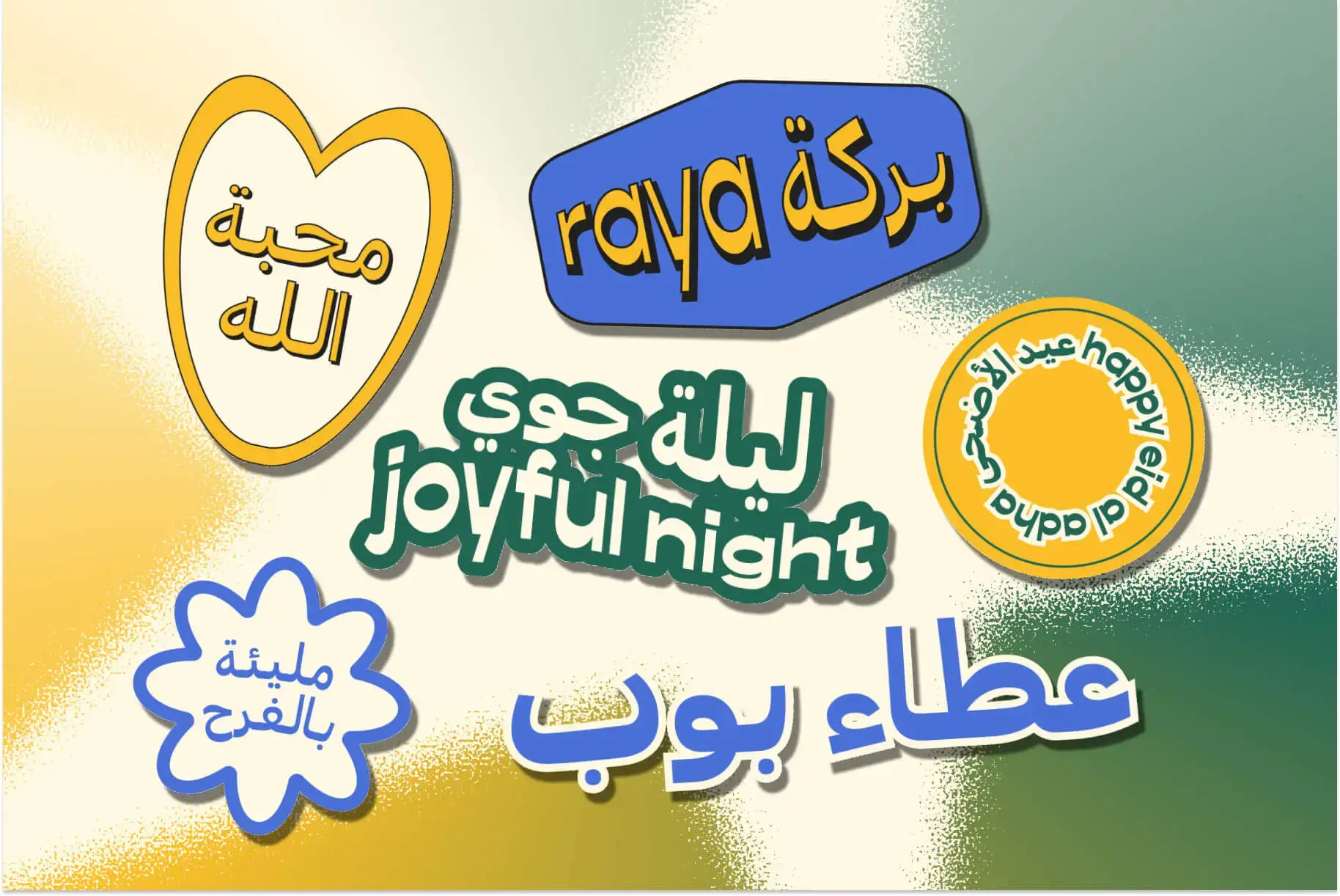
Arabic display fonts can bring dramatic contrast, unusual proportions, decorative details, and a strong visual personality to a design. They are ideal for short text where the typeface can act almost like an illustration.
Use expressive Arabic script fonts for:
- campaign posters
- event titles
- social media graphics
- album artwork
- fashion editorials
- product packaging
- special announcements
Because display fonts are designed for attention, they should be used with care in longer text. Give them a headline, a little space, and a supporting body font that knows how to keep things readable.
The result can be bold without becoming noisy.
4. Handwritten and calligraphic styles for warmth
Handwritten Arabic fonts can bring a more personal and emotional quality to a design. They may feel warm, artisanal, celebratory, romantic, or relaxed.
This style can be useful for:
- cafés and food brands
- invitations
- handmade products
- lifestyle creators
- beauty brands
- cultural events
- personal projects
A calligraphic Arabic font can create instant atmosphere, but it should not be chosen only because it looks pretty in one sample word. Test the full brand name, punctuation, numbers, and the words your audience will actually read.
The right handwritten style should feel expressive and clear. It can flirt with the eye without making the reader work too hard.
5. Arabic variable fonts for flexible digital systems
Variable fonts are becoming a practical option for multilingual digital design. Depending on the family, one font file can offer a range of weights, widths, or other variations.
This can help designers create more flexible systems for websites and applications. A light weight may work for a large editorial headline, while a heavier style may be better for buttons or navigation. A narrower variation can help a long Arabic phrase fit more comfortably on a small screen.
When reviewing Arabic variable fonts, test:
- Arabic headlines and paragraphs
- mixed Arabic and Latin text
- numerals and punctuation
- bold and regular weights
- mobile and desktop layouts
- line height and vertical rhythm
Variable fonts are not automatically the best choice for every project, but they can make a multilingual design system more adaptable.
6. Bilingual font pairing for Arabic and Latin
Many brands need Arabic and Latin text to live together. This is where font pairing becomes especially important.
The two scripts do not need to look identical, but they should feel related. Compare their weight, x-height or visual height, spacing, contrast, and overall mood.
A good bilingual system answers questions such as:
- Do the Arabic and Latin headlines have similar energy?
- Does one script appear much heavier than the other?
- Are the line heights comfortable in both languages?
- Do the fonts support the same brand personality?
- Does the layout remain balanced when the text length changes?
Look for Arabic typefaces with an intentional Latin companion whenever possible. This can create a more polished experience than pairing two unrelated fonts that happen to look attractive on their own.
The goal is not to force Arabic and Latin to dress identically. It is to help them arrive at the same party looking beautifully coordinated.
7. Arabic web fonts designed for RTL experiences
Arabic web design needs more than a font file. It needs the right direction, spacing, alignment, and layout behavior.
Arabic is generally read from right to left, so digital interfaces must be designed and tested as right-to-left experiences. This affects navigation, forms, menus, alignment, content flow, and directional icons.
When using Arabic web fonts, pay attention to:
dir="rtl"at the correct document or component level- right-to-left text flow
- line height and vertical spacing
- mixed Arabic and Latin content
- numbers, dates, and phone numbers
- form labels and input alignment
- icons that show direction
- mobile navigation behavior
Not every element should be mirrored. Brand logos, media controls, clocks, numbers, and some directional objects may need different treatment. Test the complete interface with native Arabic content rather than placeholder text.
This is where good RTL typography becomes more than a technical setting. It becomes part of the reader’s comfort and trust.
How to choose Arabic script fonts for branding
Choosing a typeface for an Arabic brand identity requires both visual judgment and practical testing.
Start with the brand personality. Is it elegant, modern, youthful, luxurious, traditional, playful, or experimental? Then compare fonts using the actual brand name.
Check:
- letter connections
- initial, medial, final, and isolated forms
- dots and diacritics
- readability at small sizes
- weight consistency
- Arabic and Latin language support
- numerals and punctuation
- logo and packaging performance
- commercial-use licensing
For Arabic fonts for branding, the most attractive option is not always the most useful one. A font may look beautiful in a large headline but lose clarity in a small social avatar or product label.
Test it everywhere your brand will live.
Free Arabic fonts and licensing
Free does not always mean unrestricted.
Before using any of the free Arabic fonts you discover, read the license carefully. Check whether commercial use, client work, logo design, font modification, web embedding, and redistribution are allowed.
A simple workflow is:
- Discover the font by mood or category.
- Type the real brand name.
- Test the Arabic and Latin versions.
- Check characters, diacritics, and numbers.
- Review the license.
- Test the font on mobile and desktop.
- Save the final font files and license information.
Flirtype can make the discovery stage more enjoyable. Browse different Arabic styles, compare type personalities, and find a promising starting point before refining the final brand system with Casloop Studio.
Common Arabic typography mistakes
Arabic typography can look elegant very quickly, but a few mistakes can weaken the entire design.
Avoid:
- treating Arabic as an English layout with reversed alignment
- using a Latin-only font and expecting good Arabic support
- ignoring diacritics and character joining
- making Arabic body text too small
- using overly tight line height
- pairing Arabic and Latin fonts with completely different personalities
- forgetting to test mixed-direction content
- using decorative lettering for essential information
- skipping commercial license research
Respect the script, test the real content, and give the letters enough room to breathe.
Final thoughts: let Arabic typography speak beautifully
Arabic script fonts bring a remarkable combination of history, movement, and modern design possibility.
A Naskh-inspired font can create elegance. A Kufi-inspired typeface can feel architectural and confident. A handwritten style can add warmth. A variable font can bring flexibility to a digital system. A well-matched Arabic and Latin pair can make a bilingual brand feel complete.
The most beautiful result comes from more than choosing a font that looks exotic. It comes from choosing a typeface that respects the script, supports the message, and works in the real world.
Explore free fonts on Flirtype, test the words your audience will actually read, and find the Arabic typeface that gives your brand its own unmistakable rhythm.
Your next design does not need to shout. It just needs to flow beautifully.
Discover your next Arabic typeface on Flirtype
Explore free fonts for branding, websites, packaging, editorial design, and every creative idea with a little extra rhythm.
FAQ
What are Arabic script fonts?
Arabic script fonts are typefaces designed to render text written in the Arabic writing system. They account for connected letterforms, positional shapes, dots, diacritics, and the visual flow of Arabic text.
Which Arabic script fonts are best for branding?
The best choice depends on the brand personality and use case. Modern Naskh styles can feel elegant and readable, Kufi-inspired fonts can feel geometric and bold, and calligraphic or display fonts can create a more expressive identity.
What is RTL typography?
RTL typography refers to designing text and interfaces for right-to-left reading systems such as Arabic. It includes text direction, layout flow, alignment, spacing, mixed-language content, and appropriate treatment of directional icons.
Can I use free Arabic fonts for commercial branding?
Some free Arabic fonts permit commercial use, while others have restrictions. Always review the individual license before using a font in a logo, website, product, client project, or commercial campaign.
Where can I find free Arabic fonts?
You can explore free fonts on Flirtype, Casloop’s free font download platform. Test each font with your real Arabic and Latin content before making a final choice.