There’s a certain calm in ocean-inspired type. Nothing feels rushed. Everything just flows.
What are ocean fonts?
Ocean fonts are typefaces shaped by the feeling of water—fluid, organic, and slightly unpredictable.
You’ll often notice:
- Curves that feel natural, not mechanical
- Subtle irregularities that add character
- A sense of motion, even in still text
They’re often used in:
- Resort and beach branding
- Skincare and wellness products
- Travel and lifestyle visuals
- Personal brands that lean expressive and soft
There’s nothing rigid about them.
Everything feels like it has room to breathe.
5 Ocean Fonts from Casloop That Flow Naturally into Your Design
1. La Tropic Summer Typeface
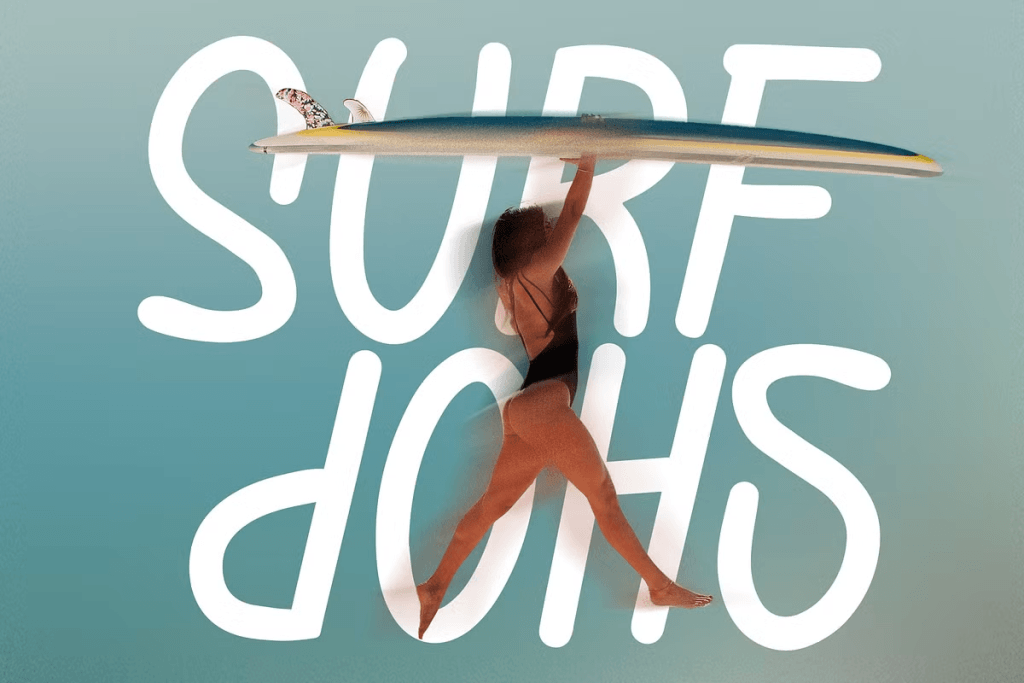
There’s a warmth that comes through almost instantly.
Not something loud or attention-seeking—just a steady, sun-soaked presence that feels easy to sit with.
La Tropic Summer carries a relaxed rhythm through its soft curves and open letterforms. The spacing feels breathable, allowing each word to unfold naturally without pressure. There’s a subtle tropical influence in its structure, but it stays controlled—never slipping into something overly decorative.
Works well for:
Beachwear brands, summer campaigns, resort identities, and travel visuals that need to feel inviting.
What makes it especially versatile is how comfortably it adapts. It can lead as a headline, or quietly support a layout without pulling everything toward itself. The balance between personality and restraint is what gives it longevity.
There’s a sense of ease here.
Like everything has already found its place.
2. Bekix – Funky Liquid Retro Y2K Font
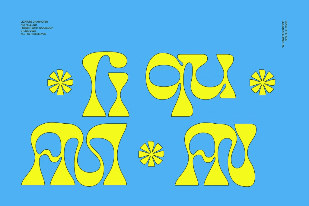
At first glance, it feels playful.
Then you start noticing the movement—how each curve seems to shift just slightly, like it’s never completely still.
Bekix leans into a liquid-inspired structure, with rounded forms and flexible strokes that create a sense of motion. The shapes aren’t rigid, which gives the typeface a more organic and expressive quality. There’s a retro Y2K influence underneath, but it feels refreshed rather than nostalgic.
Works well for:
Creative branding, bold packaging, experimental layouts, and expressive digital visuals.
It brings energy into a layout without overwhelming it. Even in larger compositions, it keeps a certain lightness—nothing feels heavy or forced.
There’s a looseness to it.
Something that keeps everything from feeling too fixed.
3. Nake – Funky Quirky Fluid Typeface
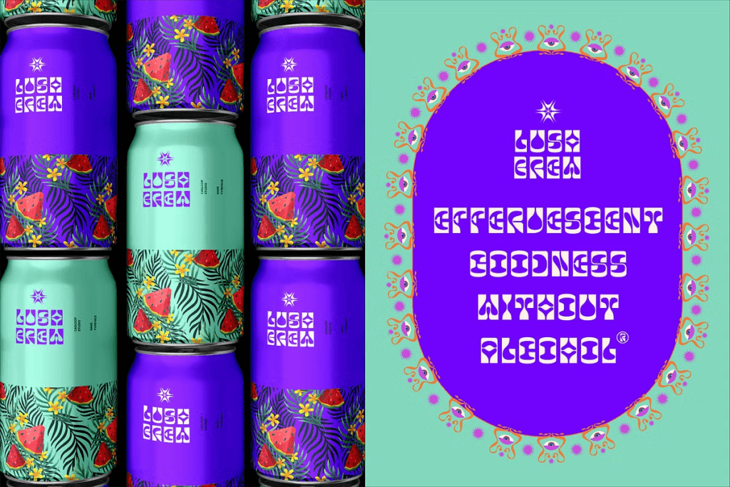
There’s a soft unpredictability here.
Not chaotic—just enough variation to keep your eyes moving.
Nake combines fluid curves with slightly quirky proportions, creating a typeface that feels alive without losing structure. The letterforms carry subtle irregularities that add personality, but they still hold together as a cohesive system.
Works well for:
Lifestyle brands, creative studios, playful identities, and modern visual storytelling.
What stands out is how it balances expression with control. It has character, but it doesn’t distract. Instead, it gently shapes the tone of the entire layout.
It leans into personality.
And then lets it breathe.
4. Red Ink – Fun Notebook Scribble Type
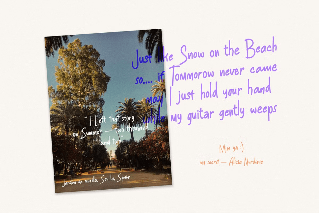
This one feels immediate.
Like something written in the moment, without hesitation.
Red Ink carries a handwritten, scribble-like quality with loose strokes and uneven flow. The imperfections are intentional, giving it a natural, human touch that feels approachable and familiar. It doesn’t try to align perfectly—and that’s where the charm sits.
Works well for:
Personal branding, journaling visuals, social content, and casual creative projects.
It creates a sense of closeness. The kind that makes a design feel less like a composition, and more like something shared.
Nothing feels overworked here.
Everything lands as it is.
5. Behind The Nineties – Sans (12 Fonts)
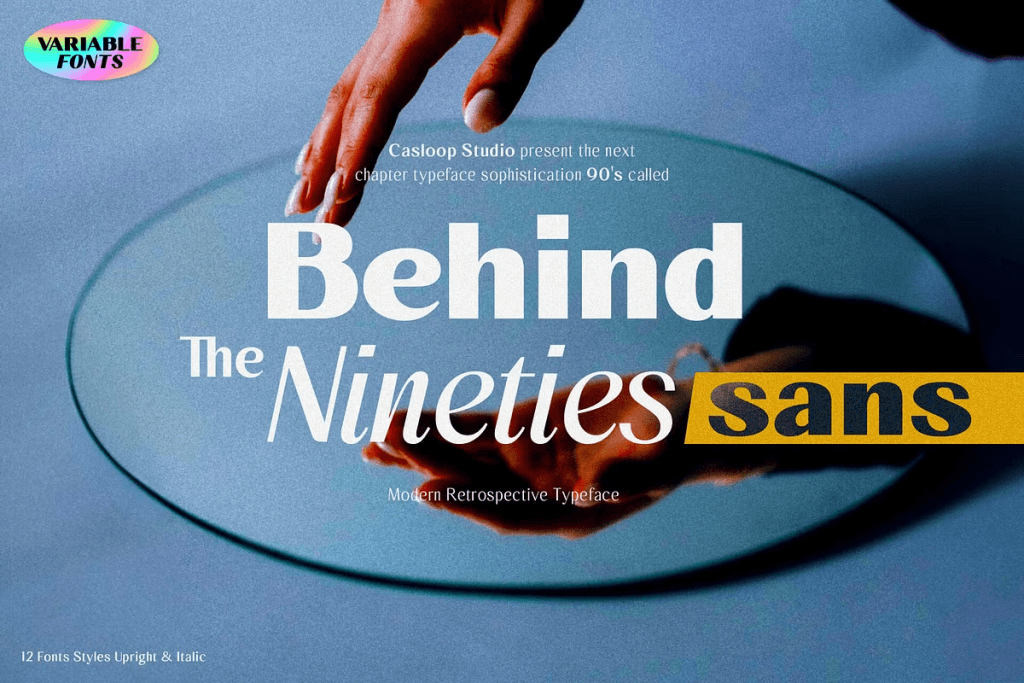
There’s a quiet structure underneath everything.
Something stable, but still soft around the edges.
Behind The Nineties is a retro-inspired sans serif with subtle curvature and balanced proportions. While it leans toward a clean and functional form, there’s a gentle rhythm in its construction that keeps it from feeling too rigid or mechanical.
Works well for:
Editorial layouts, branding systems, packaging, and layered typography.
With 12 styles included, it offers flexibility without losing consistency. It can carry an entire visual system, shifting between weights while maintaining a cohesive tone.
It holds things together.
Without making it feel tight.
When to use ocean fonts
These fonts tend to work best when your design needs to feel:
- Relaxed, but not careless
- Expressive, without being overwhelming
- Natural, with a bit of movement
They’re especially effective when emotion matters just as much as clarity.
When they don’t quite fit
There are moments where structure needs to come first.
You might want to reconsider if:
- You need strict readability at very small sizes
- The brand leans highly corporate or technical
- Precision matters more than expression
Ocean fonts move differently.
And sometimes, that’s not what the layout needs.
Pairing tips
To keep everything balanced:
- Pair with clean sans-serif for clarity
- Use negative space generously
- Let one element flow—don’t make everything expressive
It’s less about adding more.
More about knowing when to stop.
A quieter kind of presence
Some fonts feel immediate.
Some take a moment.
These tend to stay somewhere in between.
Easy to overlook at first—then hard to replace.
Explore More — Summer Bundle by Casloop
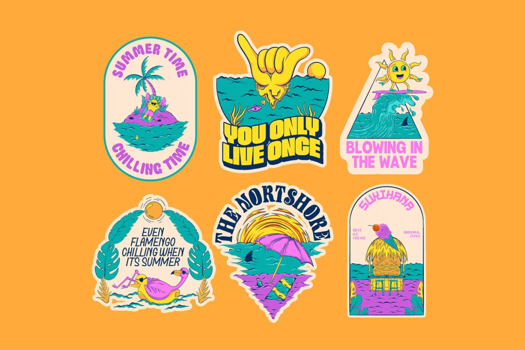
If you’re building something that leans into warmth, movement, and a softer visual rhythm, this collection brings it together in one place.
A curated set of fonts designed to feel cohesive—without feeling repetitive.
Each one carries a slightly different mood, but they sit comfortably side by side.
Take your time with it.
Some combinations reveal themselves slowly.